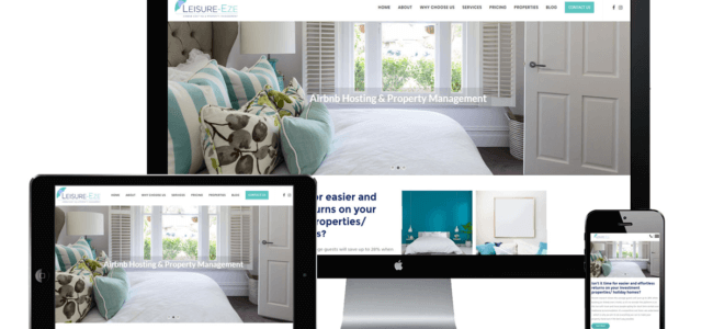
The growth in mobile usage has changed the way people interact with the world and research information online. The average person spends around 3 hours a day on their smartphone. If you want to communicate your message to an audience you will need to reach them where they spend most of their daily online time. This is why your website marketing needs to be able to adapt to a variety of devices and browsers. By using a responsive web design you’ll create an optimised browsing experience for you visitors.
What is a responsive web design?
Responsive web design is the approach suggesting that web design and development should adapt to user behaviour and environment (device orientation, screen size, and platform). This is different from building a standard mobile version of your website, which is no longer practical since there are endless resolutions and devices in use.
Responsive websites are able to automatically switch to accommodate for resolution, image size, and scripting capabilities. Flexible layouts used to be a luxury for websites, today designs are truly flexible. They can adjust to anything from a smartphone to a large computer screen. Even images can be automatically adjusted and layouts won’t break- although they can get squished in the process if your browser window size is too small.
Today’s responsive web design consists of three main components: flexible layouts, media queries (allowing designers to specify different styles of specific browsers), and flexible media (the size of the media is changed as the size of the viewport changes).
But why is being responsiveso important?
This type of design makes it possible for users to view your website optimally from any device. Reasons to use responsive design primarily centre around user experience and website performance. Even if your potential customers tend to access your website from a desktop computer or laptop, research shows that most times people don’t maximise their window page. They are actually viewing a condensed desktop browser window or a split screen and possibly not enjoying the best use experience.
Responsive design shows search engine crawlers that the page is optimised for a variety of viewing experiences, which will improve your SEO performance. Mobile responsiveness has been a key factor in determining search engine rankings since 2015 already, thus making responsive design a key website performance indicator.
Why should you invest in responsive design?
There are several reasons why you should opt for a responsive web design as part of your online marketing strategy:
-
Improving customer experience on all devices
Responsive design reduces the need for zooming in to view content, a situation that is uncomfortable and already unacceptable for most Internet users today.
-
Boosting conversion rates
Creating a consistent user experience on all devices is key to converting new customers. You need a single working website instead of redirecting users to device-specific websites. If you want potential customers to stay with you and not turn to a competitor.
-
Increase revenue generation
Your website will automatically generate more revenue when conversion rates are higher. More people will choose to purchase your products and services due to optimal user experience.
Development costs are lower when you only need to develop one website version, rather than having two different versions for desktop and mobile with ongoing maintenance costs for both.
Until the term responsive web design was coined in a 2010 essay by developer Ethan Marcotte, one of the terms to describe this type of design was “flexible” – for the simple reason that responsive web design will adapt to any device and browser size you throw at it.
Before responsive web design became the norm, you would have to zoom and scroll in order to view that portion of the web page you were interested in. When did you last open a desktop version of a web page? You probably remember how you had to zoom in to read the text and also constantly scroll to read a line from beginning to end, and do that over and over again. It is a painful experience that makes users hit the back button immediately.
-
Search engine optimization gains
Responsive design and quality content have become the two most important aspects that search engines look at when establishing rankings. Website marketing today relies heavily on search engine optimisation as your business is practically invisible if you are not on the first page of search engine results.
Responsive websites have lower maintenance needs as the alternative of maintaining a separate mobile website requires additional testing and support. This type of design is a “one size fits all” approach that means less headache for business owners, developers, and users.
Deciding if a responsive design is right for you
To decide if a responsive web design is right for your business you need to consider your services or products. Think about who your target market is and what devices they are using? Today’s modern users have access to the internet via their computer, phone and watches. In an age that’s full of smarter objects we no longer have a standard screen size. You must market to your audience with that flexibility increasingly in mind or risk losing out to competitors. Having competitive advantage is vital in business, and responsive web design is no longer the new thing to have – to stand out from the crowd. But has actually become the norm. Responsive design is something you need to do to simply stay relevant. So, the question is: do you want to be successful or not?
The only downside of a responsive design website is the set-up time, which can be longer than creating an old-style website addressing desktop users exclusively. This is where Visual Marketing Australia can help since a responsive design layout is included in all website builds we provide. To give you that functional responsive web design you need, we:
- Compressing your images
- Designing for all screens, including desktop, tablet & mobile
- Optimising your website for touch-only navigation
- Testing on all browsers
Contact us today online or at 1300 158 708 to find out more about our responsive web design services and how you can use them to provide an optimised user experience and ensure success for your business!

With over 39 years’ experience in Print Media, Sales and Marketing, Online Services & Marketing plus Financial Service industries. John brings a wealth of knowledge to Visual Marketing Australia. As a Certified Google Partner, his Digital Marketing knowledge includes: Web Design & Development, SEO, Mobile App. Development, Online Marketing, Online Video Marketing and Email Marketing Solutions. With 10 years experience in using Zoho CRM it is a natural progression to become and Authorised Consulting Partner so we can now add Sales and Marketing Automation to the list.
The post ( What is a responsive web design and why is it important?) appeared first on Visual Marketing Australia.
Source: Source link


